
That little graph thing which appears on the back of your camera can help you take better photos.
It’s a sort of graph telling you how much black, white and in-between tones are in your photo.
Huh? Don’t worry. It will make sense in a moment. But for now, let’s just say that the left side of the histogram tells you how much black stuff there is in the shot. The right side shows how much white stuff. And the bit in-between shows how much is, well, in-between.
Imagine you left your lens cap on your camera. You’d end up with a totally black image like the one below.
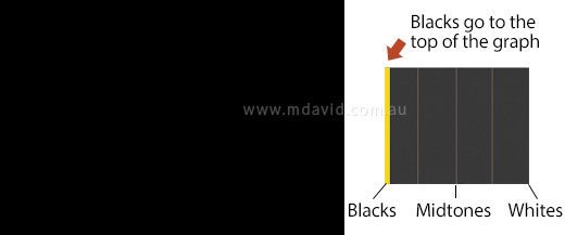
It’s a simple image, so it produces a simple histogram. On the left side (representing black) the graph would go right up off the top of the scale, because there’s such an awful lot of black. And since there are no light tones that’s all the histogram would show.
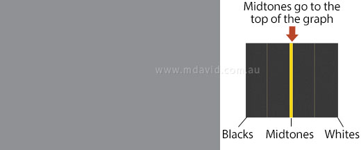
In the next example (above) the photography’s improving, but not by much. It’s a totally grey image now. The histogram shows there are lots of mid-tones and nothing else.
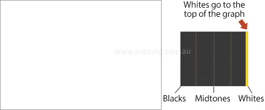
And no surprises for an all-white image. The histogram goes off the top of the graph at the extreme right because there’s so much white.
Hopefully this is starting to make sense now, so let’s have a look at a real photo.
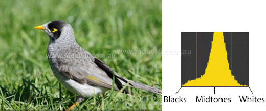
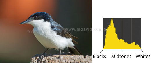
In the photo of the bird (a Noisy Miner), you’ll see that all of the tonal values in the photo, as the histogram illustrates, lie comfortably in between the extremes of black and white.
And this is a good chance to see what the histogram is really saying. See all that green grass in the photo? That green is mid-toned, meaning not white and not black but in between. And there’s a real lot of it in the shot. Which is why the mid-tones part of the graph goes up so high in the graph. And see how there’s only a small amount of blacks or whites in the photo? So, sure enough, the graph is much lower where it represents the blacks and whites.
I’ll make the point here that in this shot, the graph is making a nice even hill shape. At first you might think a nice even hill shape is good but it’s neither good nor bad. The important thing is that it all sits inside the borders defined by the right and left edges of the graph.
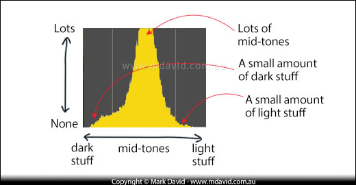
You see, that little graph is able to represent all the tonal range your camera is capable of recording, from darkest to lightest. So, as long as the graph doesn’t break out past the limits of the left or right sides then the histogram is telling you there is nothing in the photo that is either too under-exposed or too over-exposed for the camera to handle.
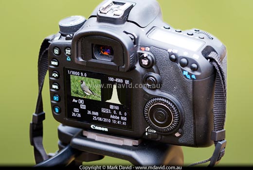
Imagine you’ve just taken a photo outside on a sunny day. You look at the little screen display on the back of your camera to see if the picture turned out okay. Well you think it did, but it’s kind of hard to tell from looking at that screen in bright sunlight.
So you look at the histogram. In the shot of the Noisy Miner bird above, you’d see that the entire captured image is made up of tonal values that sit comfortably in between the extremes of under-exposure (blacker-than-black) and over-exposure (whiter-than-white). How do you know that? Because the graph shape sits within the limits defined by the left side of the graph (too black) and the right side (too white) of the graph. The histogram makes its point very clear, even on that tiny screen in bright daylight. This tells you your camera was able to capture the full range of lights, darks, and in-betweens for that shot. If everything else kind of looks okay, then most likely the shot is correctly exposed.
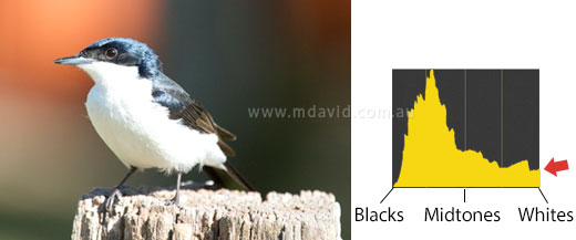
At first glance that picture might look okay on the back of your camera. You know the dark parts of the photo are okay because on the left side of the graph, there’s nothing that breaks out past the left edge. But see how on the far right of the histogram, the graph breaks out badly into the right edge (where I’m pointing with the arrow). That’s a warning sign. It means part of the shot has been ‘blown out’ (badly overexposed).
And sure enough, when you look at the resulting photo on your computer back at home, you’ll see a big band running through the bird’s plumage which has absolutely no detail — nothing but a giant ugly blob of zero-detail white nothingness (that’s a term which strangely has yet to catch on in the camera books). Even if you try to tweak the image using something like Photoshop, you’ll be disappointed. The histogram is telling you that, because the graph goes beyond the limits of white, then parts of the image go beyond your camera’s ability to capture any detail at all in those areas with those camera settings.
So, if your histogram jumps up off the right edge like it did with this picture, you need to take another shot, but this time you know you need to reduce the exposure.
Likewise, if the histogram shows the graph disappearing off the left edge then you need to take another shot, but this time increasing the exposure.
If you’re in Time Value Priority (Shutter Speed Priority) mode and you choose a faster shutter speed to reduce the exposure, the camera makes up for it by picking a bigger aperture for you. Which cancels out your change. Likewise, in Aperture Priority mode, the camera automatically adjusts the shutter speed to counter-act any change you make to the aperture. So how do you over-ride this and adjust the exposure? I mean, you just want to make thing darker, right?
In this situation, I use the camera’s exposure compensation function. You tell the camera to make things lighter or darker than it normally would. (I explain more about exposure compensation here.) Your camera’s manual will tell you how to make your camera do this. You see, camera manuals are hopeless for some things, but really good for looking up this kind of thing. In the case of the bird shot above, I’d tell the camera to adjust its exposure by about 1 stop down.
Shown above is the photo (and histogram) I got when I reduced the exposure. See how the graph sits nicely inside the range of blacks to whites again now, without breaking out of the right side any more.
So by giving a clear indication that the first image was overexposed that histogram gave me a chance to fix my exposure while I still had another chance to photograph the bird (the bird was a Restless Flycatcher, by the way.)
Chances are, your digital SLR will have an option for a ‘highlight alert’. If it does, I reckon it’s a great idea to activate it.
What a highlight alert does is this: if your camera senses that part of a shot has been blown out, it will flash that region in alternating black and white on your camera’s screen as a warning, like in the example below:
The moment you see those blinking black bits, you know you’ve got some blown-out (overexposed) parts in your image. So you get the chance to reduce your exposure and take the shot again.
Copyright © Mark David. All rights reserved


