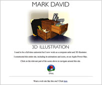

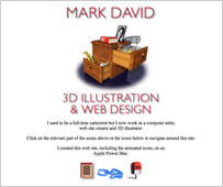
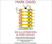
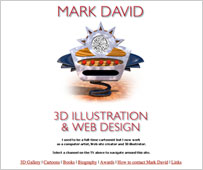
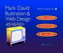
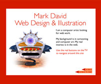
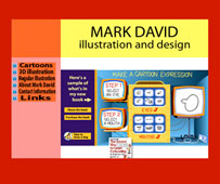
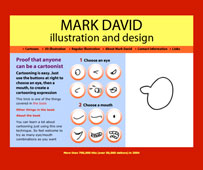
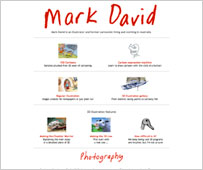

This website dates back to before 1998, which in internet terms is something like 800 dog years. Those screen grabs above show some of the looks the home page went through.
The screen grabs sort of show some of the early web design trends. For example, there was a stage when heaps of people were trying to make their home pages look like machines, complete with simulated knobs and dials and fake brushed-metal panels. You see, the brushed metal look was easy to imitate with image editing software. So there was fake brushed metal everywhere.

1: Start with a grey box. 2: Add noise. 3: Apply some motion blur.
I had a go at some machine home pages too (although I soon lost interest in the brushed metal).
Then everyone discovered Flash and so for a few years I had a Flash site.
There were some other, earlier versions of my website before these, but I can’t find those old files. Which is a shame because from memory they were pretty lame and might provide a bit of a laugh.
Yeah, I hate them too and the truth is they weren’t always there. In fact I used to have everything without watermarks, plus the option to click on them to see them in high resolution. I much preferred that.
Then one day I was doing a Google image search and discovered my photos were being used on dozens of other websites (almost all of them were blogs), and some of those bloggers were claiming to have taken my photos. And here’s the weird part: some of those bloggers using my photos were threatening to sue if anyone else used them! Is it just me, or does that sound a tad hypocritical to you too? In the end I pulled everything down and put it all back up again a week later with the watermarks. Sorry. I did at least try to make the watermarks sort of transparent so they wouldn’t be too ugly.
Over the years I’ve built this site using Claris HomePage (does anyone still remember that software?) and then Flash or Dreamweaver. In 2010 I decided to learn how to code things myself and so I hand-coded the lot (thanks for your help and encouragement, Duncan!) and I did that using the fantastic TextWrangler software. I now maintain it using BBEdit (which is like a grown-up version of TextWrangler.)
Or at least I hand-coded almost the whole lot. I ended up getting a clever buddy to write the code for my contact form (Yep, that was Duncan again).
To the best of my knowledge, pretty much all of the site now validates to the W3C standards for HTML 5. And it’s responsive too, which means it should shuffle around and resize bits of its layout to suit any size of screen, from desktop to smart phone. That was quite the learning experience making that all work.
Oh yeah, and the code’s seriously leaner than it used to be too — writing the HTML manually slashed about a half off the amount of code, and then by writing my own Javascripts to replace the remaining bits of Flash I was able to strip those pages down to about a quarter of their original size. Which should hopefully play nice with your browser, while also opening up the entire site to be viewed on iPads. And I believe it will even reduce the battery usage of your laptops!
The really cool thing is that learning to hand code was much easier than I ever thought it would be. It was mainly just a matter of writing the same things again and again until it sunk in. And that didn’t take long. In fact, the irony is that I found it to be easier than learning Dreamweaver, with the advantage that I’m no longer reliant on that software. I must admit, I’m pretty happy about that, because web standards are always changing and before learning to hand-code, keeping up with the new standards would have meant upgrading to newer versions of Dreamweaver. But Adobe changed their sales model to one where you have to pay them every month. That’s like getting another phone bill every month. Yuk. So now I don’t have to be bothered by that either!
To learn HTML I bought one of those Dummies guides and did some lessons out of it. I won’t bother telling you which book I used because that wouldn’t help you very much. Because much of it is now out of date on account of web standards changing all the time. As they do.
To learn Javascript I did a bunch of lessons in the W3C Schools free online course. W3C are always good because, since they help make the standards, their training material is always up to date. And their training stuff is very good too. They have these clever pages set up where you tinker with some code and then test it on the page. I did a bunch of those and then set myself my own challenges to learn it some more.
Learning Javascript was much harder than learning HTML, but I’m glad I stuck with it because it’s pretty amazing. I’m certainly no expert but it’s surprising what’s possible even with the basics. In fact, my gut feeling is that Javascript is incredibly powerful and capable and versatile in the right hands, but it’s one of those things where, if you’re not immersed in it regularly then you quickly forget stuff. Every now and then I go back to the bits of Javascript that I wrote and I struggle to make sense of my own code! But re-remembering it is always easier than learning it for the first time.
The information in this website is for general guidance only. While all efforts have been made to get things right, this website is for general interest purposes only and so nothing in it should be used as a substitute for professional advice.
There are some links throughout the site connecting to other websites maintained by other people. Although I occasionally check those links, the very fact that those other websites are maintained by other people means I have no control over them. They looked good when I last checked them but some of them might have changed or even disappeared since then. So if you click on a link to an external site and end up with a 404 (missing page) error, then I’m sorry about that.
Copyright © Mark David. All rights reserved | Mark David on Google+